Comparative Study on the Part-time Job UI/UX Design Patterns in French and South Korean Applications
Copyright ⓒ 2024 The Digital Contents Society
This is an Open Access article distributed under the terms of the Creative Commons Attribution Non-CommercialLicense(http://creativecommons.org/licenses/by-nc/3.0/) which permits unrestricted non-commercial use, distribution, and reproduction in any medium, provided the original work is properly cited.

Abstract
This study aims to provide UI design patterns related to accessibility and navigation to South Korean designers who intend to produce designs for French expatriates. We compare and evaluate the accessibility and navigation of French and South Korean UI design patterns, and we propose three sample designs: French, Korean, and Global UI Design. These samples are compared based on the Morville honeycomb model and tested via tasks and surveys. French participants perform tasks such as searching for jobs, applying for part-time jobs, and managing resumes. The results of surveys and interviews reveal that French participants prefer designs with a single interface, categorization and sub-menus, illustrations and icons, a homepage with suggestions, and cheerful colors. The results of this study show that understanding how French cultural preference influences UI design is essential for creating user-friendly interfaces for French expatriates in South Korea.
초록
이 연구는 프랑스 주재원을 위한 디자인을 제작하려는 한국 디자이너에게 접근성 및 내비게이션과 관련된 UI 디자인 패턴을 제공하는 것을 목표로 한다. 우리는 프랑스와 한국 UI 디자인 패턴의 접근성과 내비게이션을 비교 평가하고, 프랑스, 한국, 글로벌 UI 디자인의 세 가지 샘플 디자인을 제안했다. 이 샘플들은 Morville Honeycomb 모델을 기반으로 비교되었고, 과제와 설문조사를 통해 테스트되었다. 실험에는 프랑스인 실험 참가자들이 아르바이트를 찾고 지원하는 작업과 이력서를 관리하는 3가지 태스크를 수행하게 하고, 이에 대한 설문조사와 인터뷰를 진행했다. 분석한 결과, 실험에 참여한 프랑스 사용자들은 단일 인터페이스, 분류 및 하위 메뉴, 일러스트레이션과 아이콘의 사용, 추천이 있는 홈페이지, 밝은 색상의 디자인을 선호한다는 것을 발견했다. 본 연구는 프랑스 문화적 선호도가 UI 디자인에 어떻게 영향을 미치는지를 이해하는 것이, 한국에 거주하는 프랑스 교포를 위한 사용자 친화적인 인터페이스를 만드는 데 있어 중요하다는 점을 보여준다.
Keywords:
Cultural Differences, UI/UX Design, Accessibility, Navigation, Job Searching App키워드:
문화차이, UI/UX 디자인, 접근성, 내비게이션, 알바앱Ⅰ. Introduction
UX and UI Design can enhance productivity and performance, but dealing with cultural differences can make the process more complex. In HCI, culture is often removed from a product and replaced with content that is assumedly culture-free, or if the product is localized, with culture-specific content. They focus more on convenience by developing and maintaining language translation, currency, and time, rather than usability or user experience [1].
However, users from different cultures can have different needs, preferences, challenges, and expectations, which strongly influence people’s values, expectations, behavior, perceptions and cognitive reasoning [2].
Although HCI researchers recognize culture as an important factor, research about cultural issues and HCI needs to go further [3]. Culture analysis is crucial for recognizing and measuring differences and similarities in the user experience. Marcus (2011) suggests that culture-centered design is "inevitable" and altering the design to conform to national ideals is more important than just translating it [4]. To address cross-cultures, anthropologists such as Hofstede (2001) have developed theories that explore the dimensions of culture [5].
However, those theoretical frameworks are not used effectively by the user-interface design community [6]. We also have to keep in mind that Hofstede's Culture Model is based on old data and stereotypical assumptions, so we need to take a step back while talking about those subjects.
The goal is to provide UI design patterns related to accessibility and navigation to South Korean designers who intend to produce a design for French expatriates. It will prevent inaccurate and misunderstood design towards the French community. It will stop misleading and misinterpreted designs directed at the international community. In order to comprehend the type of design patterns required for a global audience in a local nation like South Korea, we will examine part-time job applications from both France and South Korea.
According to Leigh Dayton, South Korea has been recognized as being one of the world's most innovative nations, but is also well-known for its quick and easy service delivery [7]. Nonetheless, French users have some challenges while using programs because of the interface, which differs from the standards in their area. We thus intend to draw comparisons with France, which is now hosting and continues to become the second-largest IT environment in Europe [8].
To understand the design patterns specific to each nation, we will first analyze the design principle accessibility and the component navigation of two part-time job searching applications to evaluate the characteristics of each country. The reason for choosing two applications for each country is to determine the common UI/UX design patterns between those applications and define the characteristics for each country. We will next design three prototypes in light of the studies. The first sample is a representation of a French application, the second is a Korean application, and the third is a Global Design based on my analysis of the advantages and disadvantages of each nation's design using my knowledge as a researcher for UI/UX designers. French students who speak Korean fluently and have been used to living in South Korea will test the UI prototypes and respond to questionnaires specific to each one. We will then use the data to examine the results using ANOVA. The results will determine which kind of design patterns correspond to French users' needs in South Korea.
Ⅱ. Background
2-1 Accessibility and Navigation
Design principles are used while discussing interface design. Wilbert O. Galitz (2007) claims that design principles are the universal features of an interface and are essential to the creation of a successful interface [9]. Among the different design principles, this paper will concentrate on accessibility. The term "accessibility" refers to the system's ability to be used by as many users as possible without the need for additional modifications. There are four subcategories of accessibility: perceptibility, operability, simplicity, and forgiveness [10].
Additionally, design components represent the user interface elements and information visualization/sonification. In this paper, navigation—a process of moving between mental models using windows, conversation boxes, buttons, and links—will be the main topic [4].
2-2 Hofstede’s 5 Cultural Dimensions
Dutch cultural anthropologist Geert Hofstede (2010) used IBM employees from various cultural backgrounds to identify patterns of similarity and difference [11]. Using this data analysis, he developed his theory of the five essential characteristics shared by all civilizations around the globe. Hofstede (2024) classified 53 nations according to indices for each of his five dimensions, which were standardized to values between 0 and 100 [12]. His five dimensions of culture are the following: Power Distance, Collectivism vs. Individualism, Femininity vs. Masculinity, Uncertainty Avoidance, and Long vs. Short-term Orientation.
By using the nation comparison tool from Hofstede, we were able to observe several notable differences between those countries. The dimension of culture according to Hofstede and the differences between France and South Korea are defined in Fig. 1.

Hofestede’s nation comparison tool result for France and South Korea
- Power Distance dimension : It represents how powerful members in organizations accept unequal power distribution, higher scores indicates clear hierarchy, and lower degrees indicate questioning authority [9]. France scores high, with emotional dependency on parents, teachers, and superiors. Power is centralized in companies, government, and geographically, with CEOs often attending prestigious universities. South Korea, with an intermediate score, is a slightly hierarchical society, with a preference for centralization, subordinates expecting directives, and an ideal autocratic boss [13].
- Individualism/Collectivism dimension : Individualism emphasizes freedom, challenge, and monetary gain, contrary to collectivism which emphasises group interests and social dominance. France values individualism, which means emotional independence, strong family bonds, and strong leadership, while employees feel pressured and dependent on the central government. South Korea is a collectivistic society, prioritizing loyalty, strong relationships, and moral considerations over societal rules, with hiring and promotion decisions based on the in-group [13].
- Uncertainty Avoidance dimension : It measures a society's tolerance for ambiguity, with higher scores indicating stricter codes of behavior and absolute truth, while lower scores show acceptance of differing ideas [14]. French culture has an uncertainty avoidance, structure, and planning, excelling in complex technology development in stable environments. They are talkative, argue, and require laws, rules, and regulations. South Korea also has a high level, characterized by rigid beliefs, rigid time-management, and a strong emphasis on security and precision [13].
- Masculinity/Femininity dimension : Masculinity values achievement, heroism, and material rewards, while Femininity values cooperation, modesty, and quality of life, with women sharing these values equally. France has a unique culture with a feminine culture and a unique upper class, with lower earnings and lenient sentences for crimes of passion. South Korea is a feminine society, prioritizing equality, solidarity, quality work, and decision-making through consensus, negotiation, and incentives, with a focus on well-being [13].
- Long-Term Orientation dimension : Long-Term Orientation emphasizes practice, relationships, and patience more than Short-Term Orientation nations, which emphasize belief and immediate results [15]. France has a long-term orientation, valuing context, time, and adaptability, with a focus on traditions, saving, investing, thriftiness, and perseverance. South Korea is also a long-term-oriented society, prioritizing steady market share growth and higher capital rates over quarterly profits, aiming to serve stakeholders and society for generations to come [13].
2-3 Marcus Guidance of Hofstede’s Dimensions in Design
Mismatches between cultural needs and interface designs can significantly impact the user experience of interactive products, as users from different cultures may react unexpectedly to design patterns [15]. Thus, Marcus and Gould (2000) provided a framework for the design guidance of user interfaces based on Hoftede’s different cultural perspectives [2]. In addition, according to Marcus (2011), we were able to find the effects on web design and user interface. He claims that it has the following effects on web design and user interface [4].
- High Power Distance dimension : Information access is structured, guided, and focuses on social/moral order, expertise, leaders, integrated security, certifications, awards, and logos, with social roles organizing information [4].
- Individualism/Collectivism dimension : Individualism emphasizes personal achievement, materialism, consumerism, and controversial speech, while Collectivism downplays individual roles, favors socially supportive claims, discourages controversy, and respects tradition [4].
- Masculinity/Femininity dimension : Masculinity emphasizes traditional gender roles, work tasks, and mastery, while Femininity prioritizes mutual exchange and support, with websites focusing on exploration, control, and emotional appeal [4].
- Uncertainty avoidance dimension : High values involve simplicity, revealing results, preventing looping, using constraints, task animations, and models to reduce error, while low values involve complexity and risk, less controlled navigation, and coding of color, shape, and texture cues for maximum information [4].
- Long Term Orientation dimension : Practice is more important than theory, and personal networks provide resources for achievement, as seen in the principle of Chinese Guanxi [4].
Ⅲ. Method
This study aims to answer the following research question: "Which kind of UI/UX design patterns correspond to the French users' needs ?" To answer this question, our research first compared the UI/UX design principles of accessibility and navigation in French and Korean part-time job applications. Once each country’s design characteristics had been evaluated, we created three prototypes.
The first prototype was based on French application characteristics, the second prototype was based on South Korean application characteristics and the third prototype was based on our design knowledge after analyzing each application’s pros and cons.
These prototypes will be tested by French expatriates living in South Korea who have knowledge of Korean and are familiar with using Korean applications.
Our research aims to establish and verify the impacts of culture in design and provide a UI/UX design as a solution to give better access to part-time job searching applications for French living in South Korea. We observed that these individuals have trouble using Korean applications since the user interface is different from what they are accustomed to in their home country.
3-1 Design Processes
UI/UX design is still not well recognized in France and is sometimes mistaken for other design-related professions. However, French people typically find satisfaction in a decent enough design. They don't have high expectations regarding the UI design, as long as it is useful.
According to De Benveniste (2015), Professor Jean-Marc Camelin of the École Centrale de Paris and the École Centrale de Pékin claims that romanticism and cartesian heritage have an impact on French innovation culture, allowing the social recognition of creative endeavors as well as capitalism. They acknowledge the importance of individual innovators' contributions while also emphasizing their collective contributions. One of the world's most advanced telecom networks, France Telecom, demonstrates the benefits of this corporatism through short-term efficiency. The Silicon Valley is dominated by the creation of hardware (e.g., HP, Apple, Intel, and Microsoft), while France is dominated by the highly regulated telecom industry (e.g., Illiad, Orange, and SFR). There is a robust technical culture that produces a lot of good engineers, but not enough marketers and designers, which makes it harder to innovate and be successful in the technology sector. Although the items are of high technical quality, users could find them difficult to use. Silicon Valley's innovation culture, on the other hand, places more emphasis on the inventor and less emphasis on the innovation process. Compared to France, engineers are not as prized, but design, customer culture, and business models are. Products that are innovative offer a clear value proposition to the client and are more comprehensive [16].
According to Kim (2019), a former engineer at Airbnb, companies in Korea are hierarchical, meaning that managers and designers are regarded as subordinate to the highest ranked individual, who has all decision-making authority. To be on the market, the employer must approve of their decisions. But this system is questionable. Silicon Valley developers are faced with a triangle of development dilemmas : as the speed increases, the quality and the number of functions will decrease. On the contrary, as the quality increases, the speed and the number of functions will inevitably decrease. Also, if the number of functions increases, the speed and quality will deteriorate. In South Korea, the age-biased social hierarchy structure discourages designers from making effective solutions. For instance, the manager makes the design decisions instead of the developers, who are only following the guidelines. However, this process focuses on rapidity and quantity, which is contradictory to the triangle of development dilemmas [17].
3-2 Application Overview
To be able to understand the design differences between two different countries, we selected part-time job applications due to their need for organization and comprehensive solutions to meet the needs of users. Furthermore, the majority of part-time job applications in South Korea are only accessible in orean and are created with Korean corporate expectations, which may not align with French assumptions. We analyzed two applications from each nation using design principles of accessibility and navigation, France and South Korea, in order to determine and validate the sort of design patterns that operate best. As a result, via comparison, we were able to comprehend the design characteristics of both nations and provide a suitable design for the French target.
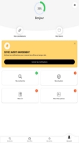
The French mobile applications HelloWork and IziWork are supported by Android and Apple iOS. Hello Work was created in 2000 under the name of OuestJob as a local digital recruitment tool for recruitment not only in Paris but in France globally by the company HelloWork [18]. All HelloWork group job sites will merge to become the HelloWork.com recruitment platform from 2022. IziWork, founded in 2018, offers a digital platform for recruitment and employment, especially for “interim”, a temporary contract job commonly used in France [19].
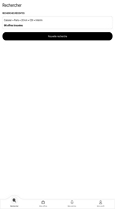
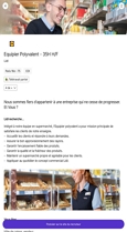
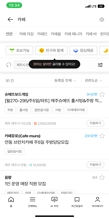
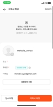
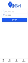
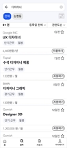
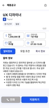
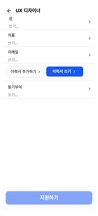
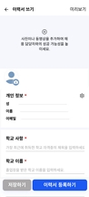
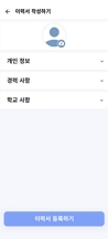
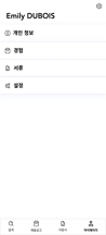
In Table 1 the key interfaces of the HelloWork and IziWork applications are represented. The first interface (A) shows the home page, including the previous research. The second interface (B) show the offer list after searching by keyword. The third interface (C) is the offer interface, including a button to apply. The fourth interface (D) is the resume completion process, including a button to add the resume. Finally, the fifth interface (E) is the profile, including interfaces to modify the profile and manage the application features.

French applications interfaces
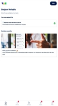
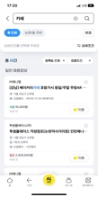
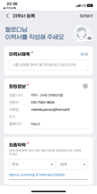
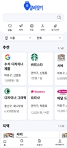
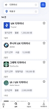
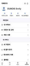
Korean applications interfaces
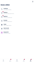
Korean mobile applications Albamon (알바몬) and Albachunkuk (알바천국) are supported by Android and Apple iOS. Albamon, under the corporation Job Korea, was founded in 2004 [20]. Albachunkuk was founded in 2003 and offers a part-time brokerage platform operated by MediaWill Networks Corporation, part of the MediaWill Group. MediaWill Networks is affiliated with MediaWill, which operates Craigslist, an international platform for job searching [21].
The second interface (B) shows the offer list after searching by keyword. The third interface (C) is the offer page, which includes a button to apply. The fourth interface (D) is the application process, including a button to add the resume. Finally, the fifth interface (E) is the profile, including interfaces to login to the profile and manage the application features.
We listed the design principle of accessibility and its four subcategories: operability, simplicity, perceptibility, and forgiveness. Additionally, we listed the design component of navigation and its six subcategories: search box, breadcrumb, pagination, tags, icons, and navigation menus. We compared these design patterns with French applications (HelloWork, IziWork) and South Korean applications (Albamon, Allbacheonkuk). The objective of selecting two applications from each country is to understand the design characteristics of French and South Korean UI/UX design patterns.
Firstly, we compared the design principles of accessibility. In terms of operability, both French and Korean applications designed the size of buttons and the placement of design elements effectively. However, Korean applications did not adequately design the accessibility of control elements. Regarding simplicity, French applications adhere to several principles that Korean applications often overlook: prioritizing important functions, maintaining an obvious visual hierarchy, simplifying commonly used actions, and hiding unnecessary screen elements. Additionally, French applications generally do not include default values in text fields and dropdowns, unlike Korean applications [10]. In terms of perceptibility, all applications from France and Korea use alterative text for images. However, Korean applications do not use redundant coding or design methods [22]. In terms of forgiveness, all applications provide clear and visible labels for buttons and links, as well as options for reviewing, changing, or undoing actions and error messages with clear instructions [9].
Secondly, we compared the navigation design components. For the search component, all applications are designed simply and clearly, looking like a search box. In addition, excluding IziWork, all applications place the search component in a position for fast access. For breadcrumb, all applications designed the current locations of users in the applications. For the pagination, all applications, excluding Albamon, highlighted the current page.
For the tags component, all applications use relevant keywords and position them close to the content. For icons, all applications designed relevant icon to their actions. However, except for HelloWork, the icons in all other applications are designed to be easily recognizable. Also, the Korean applications place icons to the left of the label, unlike French applications. For navigations menus, all applications feature a representative label for pages, a homepage with a logo, a dropdown with a navigation menu for complex design, and a footer menu. However, all applications except IziWork designed hamburger menus.
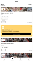
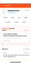
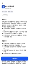
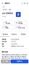
3-3 Prototype
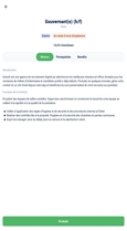
The prototypes were developed with the collaborative interface design tool called Figma. As shown in Table 3, sample A represents the French application, sample B represents the Korean application, and sample C represents a Global Design based on the advantages and disadvantages we observed during our analysis of the applications. The goal of the Global Design prototype was to create an interface that combines the most effective elements from both French and Korean designs, ensuring it meets the needs and preferences of a diverse user base. All three designs have distinct design settings, with the exception of language, font, and color schemes. Since our intended user base for the research is French expatriates accustomed to Korean applications, we decided to design the prototypes in Korean. For the typography, we used the font “Avenir”, which is a geometric sans-serif typeface designed by Adrian Frutiger in 1987 and released in 1988 by Linotype GmbH [23]. Applications for part-time jobs usually contain a lot of text therefore, it is important to keep typography basic to prevent eye strain and discomfort. The hexadecimal color Royal Blue #1C58F2 has been selected as the predominant color since it is typically associated with work applications (e.g., Indeed, Linkedin). Our choice for background and contrast is a hexadecimal grayish blue #F5F7FC. We selected a gray #B7BFC with 25% exposure for shadow effects. Lastly, the base colors are black #181A1F and white #FFFFFF. We also used the plugin libraries “Iconur-Line Icon Set” and “Content Reel” available on Figma for icons. During the tests, the prototypes were shared via a link or installed on a PC.
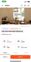
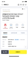
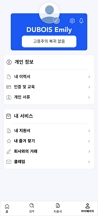
Samples A,B and C interfaces
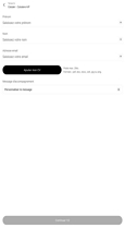
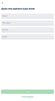
The prototype content consists of two tasks: finding and applying for part-time employment offers and managing a user's resume. Task 1 includes a home interface (A), a searching interface (B), an offer interface (C), an application process interface (D), and a feedback interface. Task 2 includes a resume completion interface (D) and profile page (E), with UI components and principles chosen based on chapter 3.2's design characteristics.
The French UI Design is simple but lacks visual hierarchy and contrast, contrary to the Korean UI Design which requires vertical and horizontal scrolling, providing an important flow of information.
The Global Design is more contrasty, with a background color set in #F5F7FC and organized with white cards and openable sections such as in the resume creation interface (D) or the home page (A), to avoid long or multiple interfaces with a low hierarchy of information.
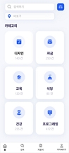
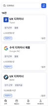
We arranged job offers with major information in four boxes below the job title (C), similar to Korean UI Design, for easier user access and quick information retrieval. Additionally, we highlighted the typography contrast by valuing the information hierarchy through the use of various font sizes and effects. The home page (A) provides categories of part-time jobs to guide users who are uncertain about what to search for.
3-4 Procedure
We designed this study around the research question: "Which of the three design prototypes is more usable for French users?" We examined the home page (A), research functionality (B), part-time job offer interface (C), application interface (D), and profile interface (E) of each country's applications in order to provide an accurate comparison. Based on those data, we created three UI prototypes, using the Figma Desktop App version 116.15.4.
After a brief explanation of the research to the users, collecting their agreement, and filling out a questionnaire about their basic information, they were given two tasks for the first sample.
The first task was searching (interfaces A,B) and applying for a part-time job offer (interfaces C,D) and the second task was to manage the resume (interface D) through the profile (interface E).
A survey about usability was conducted via a Google Form. Experiencing the UI prototype lasted around 3 minutes, and the survey based on the UI took around 5 minutes. After completing the identical task for the second prototype, the user completed the correspondent survey.
Lastly, we tested out the third prototype in the same manner, followed by the survey. To measure the opinion concerning the prototypes, we audio recorded the think aloud process from the start of the first task to the end of the experiment. We interviewed them to know which samples they preferred and the reasons why.
The comparative study will enable us to comprehend the types of design traits that exist for each nation and whether French, Korean, or Global UI Design is needed for the French community in a local country. Therefore, we asked twelve French participants living in South Korea, who are able to speak Korean and are used to Korean applications. We divided the participants into three groups, A, B, and C with 4 participants each, to prevent the first-person effect and the halo effect. We also balanced the characteristics of each group to ensure that the age and gender ratio were correct based on the pre-experiment questionnaire. The details about the participants are below in Table 4.
Demographic characteristics
In order to determine which of the three UI prototypes—French, Korean, and Global UI Design—is most beneficial for the French community in South Korea, we developed a questionnaire for this study.
The questionnaire was organized on a 5-point Likert scale. We created detailed questions corresponding to Peter Morville’s Honeycomb model (2004), and six evaluation factors: usable, useful, findable, credible, desirable, and accessible, as shown in Table 5 [24].
Survey questions
Ⅳ. Results
To analyze the results of the user test, an analysis of the Kruskal-Wallis test was performed using IBM's SPSS, a statistical analysis tool based on parametric statistical tests. The results of each item were analyzed quantitatively using a Likert scale, and post hoc interviews were grouped into semantic units. There were similarities perceived between groups A, B, and C (p >.05). As a result, we intended to conduct an experiment with twelve participants. Although the investigation focused on those twelve people, no value from Q-1 to Q-18's P-value was found to be less than 0.05. Consequently, we decided to examine not only the mean and standard deviation values but also opinions through the think aloud process and interview data of the twelve participants. Thus, we are analyzing the mean and standard deviation in case of similarities between groups.
4-1 Usable
As shown in Table 6, through Q1 (Was the design helpful to you for searching and finding a part-time job offer ?) the mean of the Global UI Design was the highest, with a mean of 4.6667 and a standard deviation of .61721.
Q-1-3 statistics mean and standard deviation values
According to the interview, the Global UI Design part-time job offer interface (C) has been considered more usable due to its categorization and organization compared to the other UI Designs.
“(The Global UI Design) It is more intuitive and much better organized, compartmentalized by job field.”
(Participant 4, Female, 30)
“(The Global UI Design) The offer was simple and effective⋯ You could really click on the part of the description that interests you⋯ It can be a little more practical.”
(Participant 8, Female, 31)
Through Q2 (Did you find the application process for a part-time job to be simple and intuitive to use?) the mean of French and Global UI Designs were both the highest with 4.5333 but have been differentiated with a standard deviation of .63994 for the French Design. According to the interview, the application process (D) of French UI Design was simpler compared to Korean and Global UI Designs. However, some participants did not appreciate the structure of the layers.
“(The French UI Design) It was simple, direct. You don't have to look for what you're looking for”
(Participant 1, Female, 31).
“(The French UI Design) It's simpler, you only have all the information you need.”
(Participant 7, Female, 31)
“(The French UI Design) It was too simple⋯ You have to get into it, read it. And then, if it doesn't fit, you go back out and have to do the same thing all over again.”
(Participant 8, Female, 31)
On the other hand, the Global UI Design application interface was not intuitive due to the sections designed into rolling pages, which create too many steps.
“(The Global UI Design) It's not very intuitive at all... In each section, there were also big sections to fill in⋯ It would certainly have been easier to have different pages where you could see all the information from the start.”
(Participant 11, Female, 24)
“(The Global UI Design) It was intuitive in stages, in keeping with the colors. You understood the steps⋯ But unrolling the pages wasn't intuitive.”
(Participant 12, Female, 25)
“The (Korean UI Design) CV submission process is a little more complicated”
(Participant 6, Female, 23)
“I didn't like the summary because there's stuff you have to fill⋯ You have to pull down a menu to fill it in.”
(Participant 1, Female, 31)
Through Q3 (How intuitive was the process of creating and managing your resume within the user interface?) both Korean and Global Design means were the highest with 4.3333 but have been different with a standard deviation of .97590 for Korean UI Design. Similarly, the part-time job offer interface (C) in South Korean UI Design has been appreciated by the participants.
“(The Korean UI Design) I'm straight to the point.”
(Participant 10, Female, 26, French)
On the other hand, the process of creating and modifying the resume (D,E) of French and Global UI Designs has been considered less intuitive.
“To find the CV in the profile (of French UI Design), it was less intuitive to have put it in the global information thing rather than in the documents.”
(Participant 6, Female, 23, French)
“You don't have too much space (in Global UI Design).”
(Participant 7, Female, 31, French)
The statistics provide equally satisfying results for French, Korean, and Global UI Designs. In addition, according to the interview answers, the Global UI Design offer interface (C) was more usable, the French UI Design application process was simpler (D), and the Korean UI Design creation and management of the resume (E) was more straightforward.
4-2 Useful
As shown in Table 7, through Q4 (Were you able to quickly identify part-job opportunities because of the design ?) the mean of French and Global UI Designs were both the highest, with 4.6667 and a standard deviation of .61721.
Q-4-6 statistics mean and standard deviation values
According to the interview, the French UI Design has been appreciated as being clear; however, the participants showed more interest in Global UI Design’s information boxes in the offer interface (C).
“The (French UI Design) application process was clearer.”
(Participant 6, Female, 23, French)
“The Global Design was more intuitive and much better organized, compartmentalized by job field.”
(Participant 4, Female, 30)
“The squares (in Global UI Design) that give you time allow you to go straight to what interests you.”
(Participant 8, Female, 31)
“Thanks to the big buttons, as sub-menu (in Global UI Design) was straightforward.”
(Participant 14, Female, 25)
Since we decided to create the boxes from Korean UI Design patterns, the Korean UI Design has also been appreciated.
“The application page (in Korean UI Design) had the four little squares that really say to call up the most important information.”
(Participant 8, Female, 31)
“(The Korean UI Design) I have direct access to the information, I don't have to search through different tabs. It's direct, simple, and easy”
(Participant 11, Female, 26)
“Key points highlighted right from the start (in Korean UI Design)”
(Participant 12, Female, 24)
“You can see straight away if it's right or wrong, and you waste less time (in Korean UI Design).”
(Participant 8, Female, 31)
Through Q5 (Was it comfortable and straightforward for you to apply for a part-time job ?) the mean of French Design was the highest with 4.6667 and a standard deviation of .48795.
“(The French Design) is not straightforward, but it's comfortable for choosing and applying for jobs.”
(Participant 10, Female, 25)
Through Q6 (How valuable does the overall user interface's resume creation and management feature contribute to your overall experience?) the mean of Global UI Design was the highest, with 4.667 and a standard deviation of .74322.
On the contrary, the French UI Design has not been considered valuable due to the structure being divided into several layers.
“The construction of the thing (French UI Design) with so many sub-parts⋯ I like to have a global view of what I'm doing.”
(Participant 11, Female, 26)
According to the statistical results, we assume that both French and Global UI Designs provide equally satisfying usefulness. However, the answers from the interview showed that the usefulness of the French UI Design has been appreciated due to its clarity and comfortability in the searching process. Moreover, the application process has not been considered less useful than the Global UI Design. The French UI Design has been separated into several interfaces, contrary to the Global UI Design which is sectioned into boxes.
4-3 Findable
As shown in Table 8, through Q7 (Did you find it easy to locate detailed information about part-time job listings, such as job descriptions and requirements?) the mean of French and Global UI Designs was the highest, with a mean of 4.5333, but has been differed with a standard deviation of .51640 for the Global UI Design. According to the interview, the categories in the home page (A) and the menu in the offer interface (C) have been satisfying; they should have better contrast.
Q-7-9 survey's statistics mean and standard deviation values
“The global interface, you've got the jobs right there... You had the icons according to what you wanted.”
(Participant 1, Female, 31)
“In the menu on the offer page (in the Global Design), you can't really see the color demarcations.”
(Participant 7, Female, 31)
On the contrary, the job offers information in French UI Design that is not easy to find, due to the lack of separations between the information. Despite the overwhelming amount of information in Korean UI Design, the participants said it was easier to find them.
“The offer announcement was in cobblestones (in the French UI Design). If there's too much text, it's going to block me, especially with my level of Korean.”
(Participant 4, Female, 30)
“As a foreigner, when there's too much stuff, you don't know where to click and what to do.”
(Participant 1, Female, 31)
“You can easily see the logo, the task that's required... For the (Korean UI Design) offer page, just a bit too much information.”
(Participant 11, Female, 24)
“The South Korean Design⋯ It's more to the point, and you know what to expect.”
(Participant 4, Female, 30)
Through Q8 (Did the design's structure provide a helpful tool for you when applying to part-time job offers?) the mean of French and Global UI Designs was the highest with 4.5333 and both have different standard deviations of .63246.
“(The Global UI Design) It was intuitive. You understood the steps... You weren't going to read a lot of boxes.”
(Participant 12, Female, 25)
On the contrary, the Korean UI Design has been described as findable for having the information in one interface, for the offer interface (C) and the resume creation (D).
“(The Korean UI Design) It was quite precise.”
(Participant 7, Female, 31)
“(The Korean UI Design) You really have more information, and you don't have to read everything.”
(Participant 8, Female, 31)
Through Q9 (Did the design effectively guide you in finding the specific features for creating and managing your resume?) the Global UI Design was the highest, with a mean of 4.7333.
We assume that the Global UI Design provides better findability than French and Korean UI Designs. The Global UI Design has been more findable due to its categorization of the job fields on the home page (A), but it needs more contrast.
4-4 Credible
As shown in Table 9, through Q10 (Was the user interface reliable while searching for a part-time job offer ?) the mean of the Global UI Design was the highest with 4.7333 and a standard deviation of .45774.
Q-10-12 statistics mean and standard deviation values
According to the interview, the participants appreciated the offer interface (A) in the Global UI Design due to the sub-menu, which is clickable.
“(The Global UI Design) The offer was simple and effective⋯ You could really click on the part of the description that interests you. And depending on the length of the total job description, it can be a little more practical.”
(Participant 8, Female, 31)
On the other side, the offer in the Korean UI Design has been appreciated, being considered clear to use.
Through Q11 (Were you able to apply to a part-time job offer without encountering issues?) the mean of French and Global UI Design were the highest with 4.5333, but have been different with a standard deviation of .59362 for French UI Design.
“The French Design asked me for the most information, but in a gentler way.”
(Participant 12, Female, 23)
On the contrary, the Korean UI Design has been described as being more confusing. Starting the resume was not satisfying due to the message, but it was not clear when the task was completed.
“(Korean UI Design) No, it wasn't easy, because I didn't realise I'd finished.”
(Participant 7, Female, 31)
Through Q12 (Was the user interface reliable in terms of feedback for the creation and management of your resume ?) the mean of French and Global UI Design was the highest, with .4.400 for French Design and a standard deviation of 1.05560.
“(The French UI Design) I saw the feedback and it stopped me in my tracks, confirming that it was good.”
(Participant 7, Female, 31).
On the contrary, the feedback was the same in Korean and Global UI Designs when adding and completing the resume.
“I was a little confused to see exactly the same interface for the CV page in the profile and for the job search (in the Korean Design).”
(Participant 11, Female, 24)
“I didn't see the feedback in the Korean UI Design.”
(Participant 10, Female, 26)
“I didn't see any feedback in the Global UI Design.”
(Participant 14, Female, 25)
We assume that the French UI Design provides better credibility than South Korean UI Design. The French UI Design has been more credible due to its clearer navigation process, and icons that have been considered friendlier. It has been appreciated due to its simplicity, and clear use of illustrations as feedback. However, the participants did not express an opinion toward the Global UI Design, except that the sub-menus categories are more credible, but the feedback was not intuitive enough due to the similarities between them.
4-5 Desirable
As shown in Table 10, through Q13 (While looking for part-time work, did the user interface's aesthetic appeal satisfy you?) the Global UI Design was the highest, with a mean of 4.4667 and a standard deviation of .83381.
Q-13-15 statistics mean and standard deviation values
According to the interview, this design was easy to use, but the color was considered less appealing, being too cold.
“The logos are good, but the colors are very basic (in Global UI Design). The colors are too similar. It's not appealing.”
(Participant 7, Female, 31)
“Very blocky, basic, and cold (in Global UI Design). It's not a welcoming place to find a job.”
(Participant 12, Female, 24)
On the other side, the French UI Design was considered boring because it was too simple. In the Korean UI Design, the home page's (A) iconography contributed to the design's attractive appearance. However, the participants were deceived by the search interface (B) due to the absence of icons.
“(The French UI Design) visually, it was really lambda, classic.”
(Participant 11, Female, 24)
“(In Korean UI Design) the home page is a little more lively because there are more colors and logos, and when you go to just your search⋯ since you don't have the logos⋯ It's a little less visually appealing. It's too banal.”
(Participant 8, Female, 31)
“The colors were softer (in Korean UI Design). There's a good use of colors, typefaces, and logos.”
(Participant 12, Female, 24)
Through Q14 (Was the offer application page's content visually pleasing through the user interface?) the mean of Global UI Design was the highest with 4.2667 and a standard deviation of .88372.
“(The Global UI Design) It was intuitive in stages, in keeping with the colors. You understood the steps... You weren't going to read a lot of boxes.”
(Participant 12, Female, 25)
On the other hand, the simplicity of the French UI Design gave a negative feeling to the participants, not trustworthy enough.
“(The French UI Design) it was too simple... There wasn't enough work.”
(Participant 1, Female, 31)
“The aesthetic of the French design is a bit austere. It's the bare minimum.”
(Participant 4, Female, 30)
“The colors are flashy. Blue is not a reassuring color. Even the icons, the illustrations... Everything is blue.”
(Participant 8, Female, 31)
Through Q15 (Through the creation and management of the resume, were you able to use the user interface comfortably ?) the mean of French UI Design was the highest, with 4.5333 and a standard deviation of 1.06010. It has been appreciated due to the good amount of information and division into several interfaces. However, it has been criticized for being too white, which may be tiring to use.
“(The French UI Design) There was less information per page, but there was a greater number of pages⋯ And I find it much more fluid to do it like that in cut.”
(Participant 11, Female, 23)
“(The French UI Design) The backgrounds were much whiter⋯ Visual fatigue will come much faster with that.”
(Participant 12, Female, 24)
We assume that the Global UI Design provides better desirability than French and Korean UI Designs. According to the interview, the Global UI Design was visually appealing due to the use of boxes, logos, and icons. However, due to the overuse of the blue color, it has been considered not welcoming for part-time job searching. On the other hand, the use of illustrations in the French UI Design has been more appreciated.
4-6 Accessibility
As shown in Table 11, through Q16 (How well was the user interface accessible to people with different levels of digital literacy?) the mean of the French Design was the highest, with 4.43333 and a standard deviation of .97590. According to the interview, this design was considered more accessible due to the fonts and separations; however, the text was described as being too small.
Q-16-18 statistics mean and standard deviation values
“It's better separated and contrasted (in the French UI Design). There was more detail on the fonts and bold effects. You don't miss a thing. Company logos were clearly visible.”
(Participant 7, Female, 31)
“The text was too small (in the French UI Design). If you scroll a little too fast, you can't see anything.”
(Participant 8, Female, 31)
On the contrary, the Korean and Global Designs have been described as not intuitive and overwhelming. However, the categories on the home page have been appreciated.
“(The Korean UI Design) is not necessarily intuitive for everyone.”
(Participant 7, Female, 31)
“For someone who has trouble seeing... It would have been nice to have more delineation between search results (in the Korean Design).”
(Participant 8, Female, 31)
“(In the Global Design) the category names are bold and practical. It's immediately obvious.”
(Participant 11, Female, 26)
“A person who's struggling a bit more, if they use the Global Design, is going to be completely overwhelmed. Too much information all at once.”
(Participant 11, Female, 24)
Through Q17 (How well did the user interface design make sure that the background elements and text had enough color contrast to make reading text easy?) the mean of the Global Design was the highest, with 4.6000 and a standard deviation of .63246. However, for better accessibility, according to the participants in the interview, the design should have more contrast in the design and writing patterns.
“(The Global UI Design) Even though I don’t have good eyes, the contrast was good.”
(Participant 7, Female, 31)
“(The Global UI Design) The writing should have enough color and contrast⋯ to make it very easy to read.”
(Participant 14, Female, 25)
On the contrary, the participants said that the South Korean UI Design lacks contrast and the French UI Design is confusing to use.
“The French Design is less accessible. We'll try to⋯ go everywhere.”
(Participant 10, Female, 26)
“(The French UI Design) The fact that there are fewer elements, colors, or uses. I think it's much whiter. The colors don't stand out as much, there's less contrast.”
(Participant 12, Female, 24)
“A lot of writing (in the Korean UI Design).”
(Participant 7, Female, 31)
“The size of the title font and the company name are less relevant (in the Korean UI Design).⋯ It's a bit harder for a beginner.”
(Participant 11, Female, 24)
“There aren't any big contrasts, and the structure is very square in the Korean Design.”
(Participant 11, Female, 24)
Through Q18 (How well did the consistent structure of navigation menus and buttons assist you in navigating through the user interface?) the mean of the French Design was the highest, with 4.6667 and a standard deviation of .61721. According to the participants in the interview, the flow was considered satisfying, but they advised that fewer steps would be better.
“Very good flow.”
(Participant 12, Female, 24)
On the contrary, the Korean UI Design navigation has been appreciated compared to the Global UI Design.
“The navigation of the Korean Design is simpler.”
(Participant 11, Female, 24)
“Just as you tidied it up, I had to navigate in the Global Design.”
(Participant 10, Female, 26)
We assume that the French UI Design provides better accessibility than the Global and South Korean UI Designs. The French UI Design has been more accessible due to the contrast of the fonts, but the greater number of interfaces with fewer contents inside has not been considered accessible. However, the contrast has been much more appreciated in the Global UI Design, even though the font was not big enough. Finally, the navigation has been the most accessible in the Korean UI Design because it requires fewer steps.
Ⅴ. Discussion and Conclusion
The outcomes of comparing applications from France and South Korea showed that there are significant differences between the two countries' UI/UX design approaches. We compared and evaluated three samples such as French, South Korean UI designs in order to give design guidelines for French users in South Korea. This study highlights issues that require more investigation and discussion, such as the requirement to suggest UI design patterns related to accessibility and navigation that are suitable for South Korean designers who are targeting global markets.
5-1 Limitations
However, this study encounters some limitations. First, this study is limited to the analysis of UI design patterns in part-time job search applications. Thus, future studies will explore the cultural differences between South Korea and France in the context of other types of applications and interfaces. This will help in developing a broader understanding of how cultural factors influence UI design preferences and usability across different application domains.
Secondly, the experiment's disappointing results persisted throughout the experiment. Catering for French proficient in the Korean language during the experiment proved to be challenging. We were unable to fully analyze the experiment's outcomes because of the small number of participants. It is still challenging to determine which design—French or Global UI Design—is more well-liked by the participants. As a result, our goal for future studies is to adjust the Global UI Design in accordance with the aforementioned instructions from the participants and test it once more with the same objective.
5-2 Findings
The present research offers the following topics open for experimentation and discussion. In order to comprehend the differences between French and Korean UI/UX design for part-time employment, we first compared the design patterns, using the subcategories of the design concept accessibility and the design component navigation.
We examined the UI/UX design for two part-time job search applications from South Korea and France. We discovered that French UI/UX design is typically layer-based, with minimalist design presenting the most important information in a clear hierarchy. The usage of imagery, icons, and keywords is predominant, and the language emphasizes the contrast rather than the colors. Its main feature is its ease of usage.
However, Korean UI/UX design gives distinct access points through hamburger menus for the same function, displaying as much information as feasible for more transparency and information accessibility. Depending on the interface, several approaches are taken with aesthetics, such as backdrop color contrast, appropriate font size, and iconography. Its main goal is to provide the most quantity of information quickly.
We used those facts to develop three samples, representing a French UI Design, a South Korean UI Design and a Global UI Design—based on the negative and positive points we observed in the other designs. Next, in order to determine the most suitable UI Design patterns in accessibility and navigation, we gathered post-interview data and survey findings.
In analyzing the preferences of French users, it is important to consider the cultural context. French users exhibited a strong preference for a single interface with well-defined categorization and sub-menus. This preference can be attributed to the high uncertainty avoidance in French culture, where users favor structured and predictable navigation paths to reduce ambiguity and improve ease of use. Additionally, the French value clarity and efficiency, which aligns with their preference for categorization and sub-menus that provide a clear and organized structure for accessing information.
The use of illustrations and icons was also favored by French participants. This preference aligns with France's high power distance, where visual elements often help in communicating hierarchical information clearly and effectively. It enhances the overall user experience by making the interface more engaging and easier to navigate.
The preference for a homepage with suggestions reflects the French emphasis on individualism, where users appreciate personalized content that caters to their specific needs and interests. A homepage that offers tailored suggestions helps users feel understood and valued, enhancing their engagement with the application.
Cheerful colors were preferred by French users, which can be linked to France's feminine culture that values quality of life, aesthetics, and emotional appeal. Cheerful colors create a positive emotional response, making the interface more inviting and pleasant to use.
The preferences exhibited by French participants in this study are deeply rooted in their cultural background. Understanding this cultural backdrop helps explain why French participants favored certain design elements in our study.
5-3 Design Guidelines
Therefore, the design must adhere to the following guidelines for better adaptability for the global target in South Korea with regard to part-time job searching.
Firstly, the information should be in one interface, such as the Korean UI Design, rather than being divided into multiple sections, as seen in the French and Global UI Design.
Secondly, one interface may use categorization with a submenu for access to information and box sections for simplified access to information, such as in Global UI Design.
Thirdly, the design must stay straightforward while striking a contrast, as represented in the Global UI Design. It improves the organization and aesthetic. The contrast includes the color of the background, icons, illustration, and font.
Fourthly, the use of illustrations and icons to make information easier to avoid excessive use of text for visual fatigue.
Fifthly, the use of a home page with suggestions of areas helps the participants have ideas about what to search for, like in Global UI Design.
Lastly, although a range of hues and tones can be used, more cheerful colors should be used in favor of blue to convey a friendlier emotion.
References
- M. Kamppuri, Theoretical and Methodological Challenges of Cross-Cultural Interaction Design, Ph.D. Dissertation, Itä-Suomen Yliopisto, Kuopio, Finland, May 2011.
-
A. Marcus and E. W. Gould, “Crosscurrents: Cultural Dimensions and Global Web User-Interface Design,” Interactions, Vol. 7, No. 4, pp. 32-46, July 2000.
[https://doi.org/10.1145/345190.345238]

-
S. Galiya, N. Gulnar, and S. Zaure, “Cultural Integration of Kazakhstan: Challenges and Opportunities,” International Journal of Social Science and Humanity, Vol. 5, No. 9, pp. 779-782, September 2015.
[https://doi.org/10.7763/IJSSH.2015.V5.555]
-
A. Marcus, “Cross-Cultural User-Experience Design,” in Proceedings of the 4th International Conference on Diagrammatic Representation and Inference (Diagrams 2006), Stanford: CA, pp. 16-24, June 2006.
[https://doi.org/10.1007/11783183_4]
- G. Hofstede, Culture’s Consequences: Comparing Values, Behaviors, Institutions and Organizations across Nations, Thousand Oaks, CA: Sage Publications, 2001.
-
A. Marcus, “Cross-Cultural User-Interface Design for Work, Home, Play, and on the Way,” in Proceedings of ACM SIGGRAPH ASIA 2010 Courses (SA ’10), Seoul, 5, December 2010.
[https://doi.org/10.1145/1900520.1900525]
-
L. Dayton, “How South Korea Made Itself A Global Innovation Leader,” Nature, Vol. 581, No. 7809, p. S54, June 2020.
[https://doi.org/10.1038/d41586-020-01466-7]
- Dirox. The State of French Tech in 2022 & 2023 [Internet]. Available: https://dirox.com/post/the-state-of-french-tech-in-2022-2023/, .
- W. O. Galitz, The Essential Guide to User Interface Design: An Introduction to GUI Design Principles and Techniques, 3rd ed. Indianapolis, IN: Wiley, 2007.
- Z. Madsen and A. Talstoi, The User Interface and User Experience of Web Design, Student Thesis, Blekinge Institute of Technology, Karlskrona, Sweden, June 2018.
- G. Hofstede and G. J. Hofstede, Cultures and Organizations: Software of the Mind, 2nd ed. New York, NY: McGraw-Hill, 2005.
- Hofstede Insights. Country Comparison Tool [Internet]. Available: https://www.hofstede-insights.com/country-comparison-tool?countries=france%2Csouth+korea/, .
- A. Marcus and E. W. Gould, “Cultural Dimensions And Global Web User-Interface Design: What? So What? Now What,” in Proceedings of the 6th Conference on Human Factors and the Web, Austin: TX, 48, June 2000.
-
G. Hofstede, “Dimensionalizing Cultures: The Hofstede Model in Context,” Online Readings in Psychology and Culture, Vol. 2, No. 1, December 2011.
[https://doi.org/10.9707/2307-0919.1014]
-
K. Majrashi, M. Hamilton, and A. L. Uitdenbogerd, “Cross-Platform Cross-Cultural User Experience,” in Proceedings of the 30th International BCS Human Computer Interaction Conference (HCI ’16), Poole, UK, 20, July 2016.
[https://doi.org/10.14236/ewic/HCI2016.20]
- The Innovation and Strategy Blog. Comparative Innovation Culture: China, Silicon Valley and France [Internet]. Available: https://theinnovationandstrategyblog.com/2015/12/15/culture-dinnovation-comparee-chine-silicon-valley-france/, .
- EO (Entrepreneurship & Opportunities). ‘I Was Happy’ Silicon Valley Story Told by a Korean Developer [Internet]. Available: https://eoeoeo.net/2020/12/07/%ED%9A%8C%EC%82%AC%EA%B0%80-%ED%96%89%EB%B3%B5%ED%96%88%EC%96%B4%EC%9A%94-%ED%95%9C%EA%B5%AD%EC%9D%B8-%EA%B0%9C%EB%B0%9C%EC%9E%90%EA%B0%80-%EB%93%A4%EB%A0%A4%EC%A3%BC%EB%8A%94-%EC%8B%A4%EB%A6%AC/, .
- Hellowork Group. Groupe [Internet]. Available: https://www.hellowork-group.com/fr/groupe/, .
- Iziwork. A Propos [Internet]. Available: https://www.iziwork.com/fr/a-propos/, .
- Albamon. About the Company [Internet]. Available: https://www.albamon.com/company/brief, .
- Albachunkuk. Official Website [Internet]. Available: https://www.alba.co.kr/, .
- LinkedIn. Unlock the Secrets to Inclusive Design: Master the 7 Principles of Universal Design [Internet]. Available: https://www.linkedin.com/pulse/unlock-secrets-inclusive-design-master-7-principles-fred-mercedes, .
- MyFonts. Avenir Font Linotype (Typeface) [Internet]. Available: https://www.myfonts.com/fr/collections/avenir-font-linotype/, .
-
H. J. Kang and S. I. Kim, “Evaluation on the Usability of Chatbot Intelligent Messenger Mobile Services - Focusing on Google(Allo) and Facebook(M Messenger),” Journal of the Korea Convergence Society, Vol. 8, No. 9, pp. 271-276, September 2017.
[https://doi.org/10.15207/JKCS.2017.8.9.271]
저자소개

2019:University of Paris 8 Vincennes-Saint-Denis, France (Bachelor of Visual Arts)
2023~Present: Sogang University (Master of Art & Technology)
※Interested areas:UX/UI Design, Interaction Design
2004:Design College of Kookmin University, Korea (Bachelor of Fine Art)
2007:Graduate School of Kookmin University, Korea (Master of Design in Interaction Design)
2013:Graduate School of Media Design of Keio University, Japan (Ph.D in Media Design)
2013~Present: Professor at Sogang University (Art & Technology Major)
※Interested areas:wearable interaction, multi-modal, multi-sensory interaction, media design, etc